WanderWise
Team Project | Spring 2024
UX UI Design | Figma
TEAM
MY ROLE
UX Research, User Interview, UI Design, and Project Management
Safety is a major concern that deters people from solo travel. In collaboration with two other UX designers, we created WanderWise to redefine the solo travel experience. By providing reliable and transparent data, our platform helps mitigate these concerns.
Leveraging user preferences and feedback, WanderWise optimizes route planning to enhance safety perceptions. The platform also offers navigation assistance, crowd-sourced data, access to a community network, and personalized safety alerts, ensuring a secure and enjoyable journey.

Problem
Solo travel represents 18% of global travel bookings, emphasizing its significant market presence. However, solo travelers express greater safety concerns than those traveling with companions, highlighting a crucial area for enhancement in travel services.
Target Users

"I prioritize my safety but I am also on the trip at a certain point and want to experience that."
Pain Points
-
Struggles to find a reliable support network for immediate assistance in emergencies
-
Face challenges in safely returning to accommodations after evening activities
Goals
-
Seek safety alerts that provide relevant information without being overwhelmed
-
Gain access to reliable live information to assess potential risks in surroundings
Explore the city
Like to travel
Value safety
Goal
How might we help solo travelers prioritize their safety by providing reliable, real-time information during their trip, without overwhelming them?
Outcome
We introduce WanderWise, a mobile app designed as intelligent safety assistance for solo travelers.
The app features a map-based interface that prioritizes navigation, highlighting the safest routes generated from API online sources and crowd-sourced data. WanderWise aims to deliver trustworthy information, empowering users to make informed, independent decisions.

KEY FEATURE 1
Location-Based Map with Safety Alert Info
WanderWise's explore screen features concise safety alerts with key details like incident type, distance, and time elapsed, sourced from reliable outlets and displayed with clear icons for quick recognition.
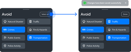
KEY FEATURE 2
Safety Avoidance Selection
Integrated personalized safety information prevents information overload by delivering tailored alerts that match individual preferences.
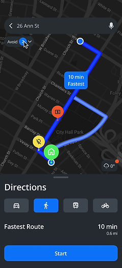

KEY FEATURE 3
Multiple Suggested Routes with Detailed Info
The navigation feature offers routes prioritized for safety or speed, tailored to user preferences. Routes are color-coded to show risk levels, empowering users to make informed choices and navigate safely,.
Research Overview
We employed 4 research methods to understand the critical safety challenges for solo travelers and identify the existing market gaps in addressing safety issues during travel.
42 Responses
To identify key safety concerns in solo travel, gaining both quantitative and qualitative insights.
GUERILLA INTERVIEW
11 Strangers
To cross-verify the safety considerations identified in the survey and to understand their universal applicability.
FOLLOW-UP INTERVIEWS
6 Sessions
In-depth interviews targeted individuals from the survey pool who expressed a willingness.
COMPETITIVE ANALYSIS
3 Analysis
To identify and analyze digital tools, evaluating their strengths and weaknesses to discover market gaps.
COMPETITIVE ANALYSIS
What are the limitations of current safety practices?


• Potential for misinformation
• Potential for fear-mongering
• Privacy concerns

• Potential for over-monitoring
• Battery drain
• Costs and subscription model


• Reliability of user reviews
• Limited coverage
• Inaccurate or outdated information
Research Findings


01
Nighttime safety and transportation safety are the top two concerns
Over 70% of survey respondents highlighted these two safety categories in their answers.
03
Widely adopted safety apps have clear limitations
Location sharing is less effective in unfamiliar areas without local support, and business activity doesn't guarantee safety.
02
There is a trade-off dilemma between safety and experience
Concerns about the timing and location of evening events lead some travelers to forego these experiences to avoid risks.
04
Travelers are being fatigued by constant safety alerts
Travelers aim to strike a balance between safety and enjoyment, preferring not to be constantly reminded of potential dangers.
Design Requirements
Previous research findings allow us to prioritize common concerns and establish corresponding design requirements:
Primary
✅
Reliable Live Information
Primary
🔔
Balanced Safety Alers
Secondary
🧭
Assistance with Nighttime Navigation
Secondary
🌐
Accessible Support Network
WanderWise
We have decided to design a mobile navigation app that offers the safest routes with updated information, personalized notifications to avoid overload, and access to local support.
Design Process
We used storyboards and flowcharts to visualize a typical scenario of navigating back to a destination at night, highlighting the use case in a real-world context.

Miranda enjoys her nightlife at a bar during solo travel.
About to leave, she opens WanderWise and filters a safe route back.
Miranda left the bar.
She follows the route suggested by the app.
Miranda arrives at the hotel safely.

Users can view safety alerts along their route.
Allow users to customize their routes by selecting safety categories they wish to avoid.
IDEATION
Flowchart
PROTOTYPING
Paper Prototype
Based on the flowchart, we developed paper prototypes to simulate the user journey, which lays the foundation for the high-fi prototype.
Main Screen

View Safety alerts nearby
Navigation Screens


Inform users about the route's suggestions
Safety Avoidance

Pop-up avoidance component
ITERATION
Usability Testing
Our team did two main rounds of usability testing, covering both the paper and high-fidelity prototypes. Through these tests, we identified the main areas for improvement.
4 Tasks & 4 participants
01. Generate paths to the desired destination
02. Add safety concern “Traffic”
03. View nearby safety alerts
04. View safety issues happening on the route
Identified 4 Areas for improvement


Issue 1
Issue 2
Issue 1
Prefer Icon Interaction
Problem: Users want to click on the icons, but nothing happens
Design Solution: Add clickable icons with safety issue titles
Issue 2
Unclear about the Incident status
Problem: Users are unsure whether the issues have been resolved or not
Design Solution: Add the link for viewing more information about each safety alert to give users the autonomy to decide whether they want to delve into more details or not

Issue 3
Issue 3
Wonder the level of risk associated with safety issues
Problem: Users wonder about the frequency and the time of the day the issue usually happens.
Design Solution: Add detailed safety information and incorporate various icon colors to show different safety levels
Issue 4
Issue 4
Lack of Action Feedback
Problem: Participants were unsure if they added a safety category successfully
Design Solution: Include a "Done" button and confirmation popup to provide clearer user feedback
Reliable Live Information to provide transparent information
Interactive safety alert icons for quick visual identification

Location-Based Map
Data from reliable outlets like news sources gives users direct access to the source.
Option to select safety avoidance features when choosing routes
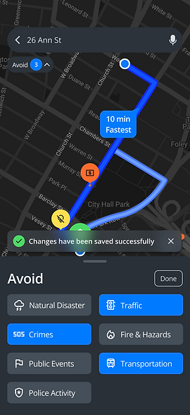
Delivering balanced safety alerts
This approach delivers tailored and relevant safety considerations specific to each user's preferences, ensuring that the information is actionable and directly impacts their safety
Assistance with nighttime navigation
Offers multiple routes for navigation, including the safest and fastest options. The system generates these routes based on users' safety preferences

While the fastest route prioritizes time efficiency, it may pose some safety concerns. This approach supports risk mitigation and enhances user confidence in their chosen route


Retro
After presenting the project at UMSI EXPO 2024, the judges acknowledged the following aspects:
-
The concept
-
Visual display
-
Research methods
-
The solution's alignment with addressing the problem
Feedback for future development includes:
-
Reevaluating use cases to differentiate from existing transit apps and align with WanderWise's core value proposition.
-
Specifying WanderWise's time horizon for utility, distinguishing between immediate safety concerns and future travel planning.
If we have more time: Due to time constraints, we haven't developed the accessible local network as planned, which remains a priority for future development.
Takeaway: This project embodies the entire design thinking journey, particularly focusing on brainstorming solutions after defining the problems.